SenseTime's SenseNova U1 Pro renders native 8K images where the fine print survives a zoom
- SenseTime launched SenseNova U1 Pro at WAIC on July 18. It's the flagship of the SenseNova U family, and its pitch is getting a complex layout right on the first pass.
- Four claimed capabilities: professional design sensibility, native output up to 8K, layout and text control in dense text-heavy images, and a generation loop that can run dozens of rounds toward a single goal.
- The architecture underneath is new. Both middle components — the one that used to "see" images and the one that used to "paint" them — are gone. Understanding and generation now share one representation, with no translation step in between.
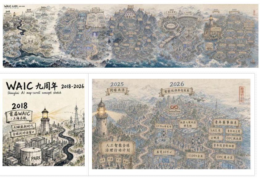
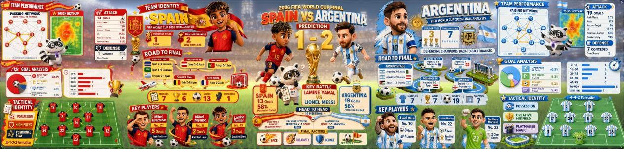
- Three demo pieces were shown on stage: a 4:1 ink-wash scroll for WAIC's ninth anniversary, a film pre-production set with 22 consecutive storyboard frames output in one shot, and a pre-match prediction report for the World Cup final.
- An open-source version on the same architecture, SenseNova U1 Lite, shipped in April under Apache 2.0. There's a free hosted playground, and the GitHub repos have passed 8,000 stars.
- The open-source release lists its own known weaknesses — one of them being that text rendering still breaks down in dense scenes.
- U1 Pro is currently an invite-only preview. The public release is planned for August, with pricing and API details announced at the same time.
AI images look great, but the text always smears
Say you need a poster for a city marathon. Headline, race date, meeting point, a registration QR code in the bottom right — every position fixed.
The result comes back with a nice composition and the right palette. Zoom in and the date line has smeared into two blots of ink; the "26" in "October 26" has picked up an extra stroke. So you write a more detailed prompt and run it again. This time the text is crisp, but the QR code has migrated to the top left and the whole layout has been reshuffled.
Third try, fourth, fifth. Each one is an entirely new image, and you end up picking whichever result annoys you least, then patching it by hand in Photoshop. The process has a nickname among people who do this daily: pulling the slot machine lever.
Change one thing, and only that thing changes. Bump the date up two points, leave everything else alone.
Change one thing and the whole image gets redrawn. Right font size — but new composition, new colors, and the QR code has moved.
Lin Dahua, SenseTime's co-founder and chief scientist, split the problem into three stages on stage. The first is making images that look real. The second is being able to revise them through natural conversation. The third is handing over something usable in an actual production setting. In coding tools those stages map to Copilot-style completion, intent-driven Vibe Coding, and system-level Agentic Coding. Multimodal models — the ones that handle text and images together — are walking the same path, just a few steps behind.
Being able to converse with a model is not the same as being able to ship what it produces.SenseTime, at the SenseNova U1 Pro launch
SenseTime shipped SenseNova U1 Pro
At the 2026 World Artificial Intelligence Conference on July 18, SenseTime introduced SenseNova U1 Pro, the flagship model in its SenseNova U family.
Moving past photorealistic detail to composition, color, and typography that actually hold together — output at professional delivery quality.
The old bottleneck: photoreal but ugly, and a designer still had to redo the layout.
Native 8K resolution and unusual aspect ratios, for very long or very large formats. Zoomed in, text, lines, icons, and the relationships between blocks stay stable — enough to survive print and exhibition scrutiny.
The old bottleneck: generated images worked as sketches and fell apart at real print size.
Holding layout and content together at extreme information density, with a very low text rendering error rate.
The old bottleneck: smeared type, wrong characters, blocks landing in the wrong place.
Continuously understanding, planning, executing, checking, and correcting around one complex goal, across dozens of rounds. The new version supports controlled editing of both overall style and local text.
The old bottleneck: you could only reroll, never fix one spot.
What it can actually produce
Every piece on the product page comes with the Chinese prompt that generated it. The most telling one is this, because it describes no layout at all.
帮我做一个周六去周日回的溧阳旅游攻略,涵盖景点、住宿和小吃
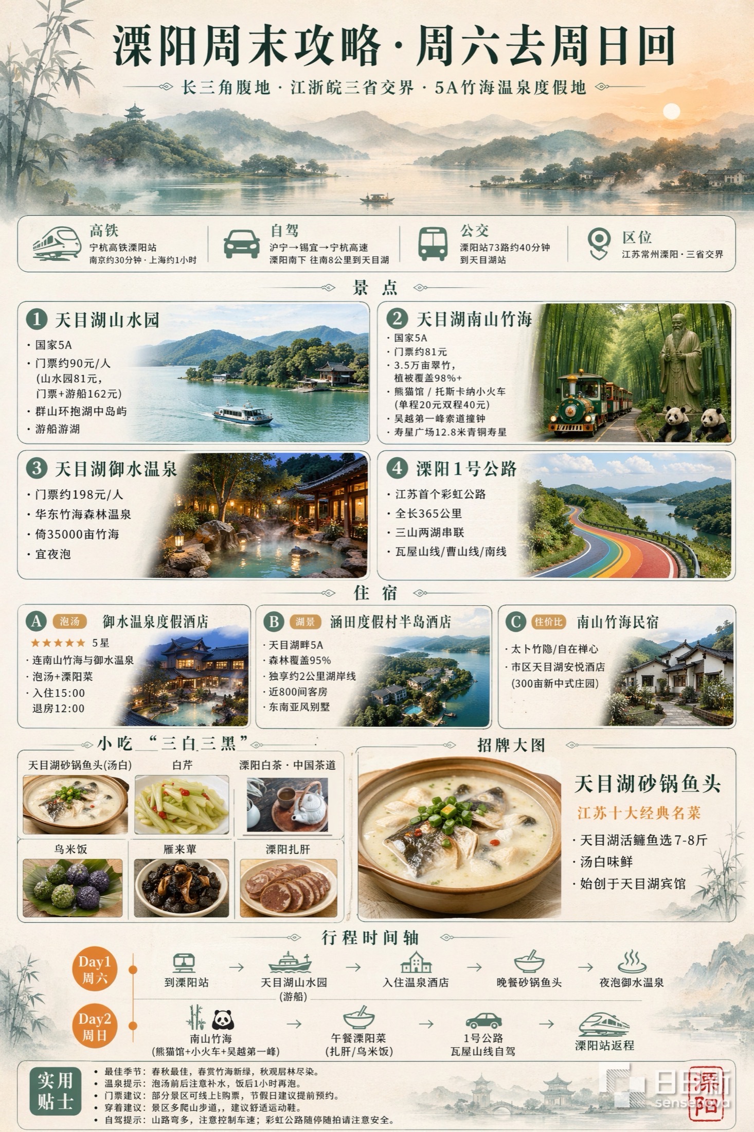
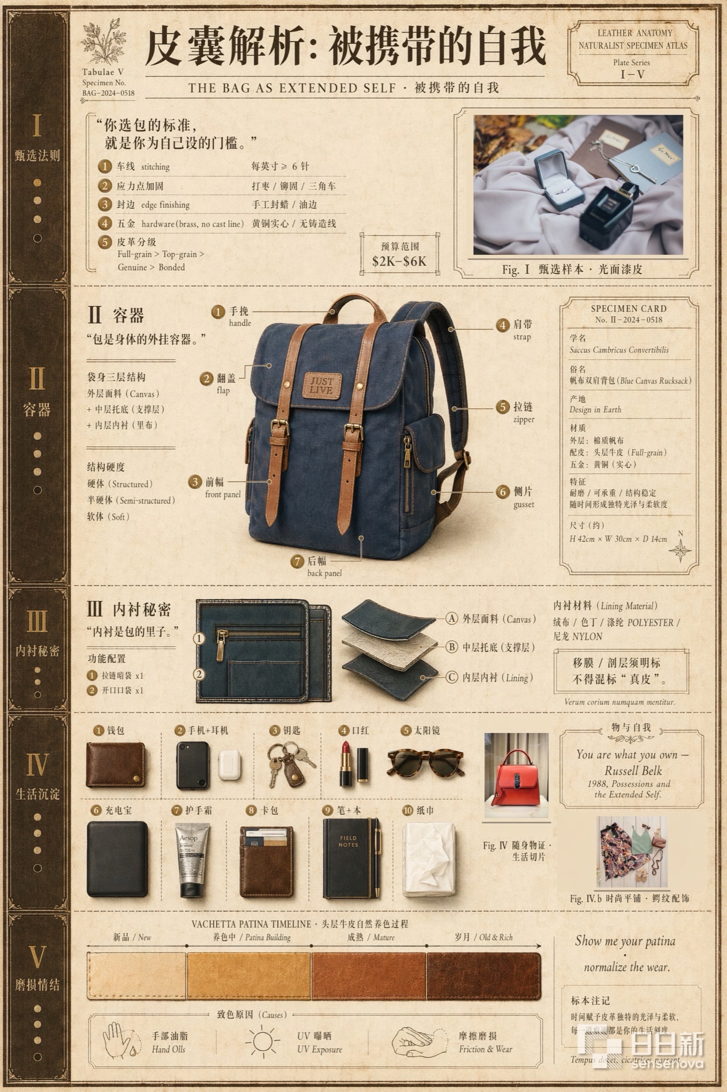
The other category is long prompts that specify the layout down to the millimeter. This one is fully visible, and the names of all five modules come straight from the prompt:
生成一幅以手提包为核心主题的信息图,标题为《皮囊解析:被携带的自我》,探讨个人物品与自我身份的关系,包含甄选法则、容器、内衬秘密、生活沉淀、磨损情结五个主题模块
Those intimidating long prompts probably weren't written by hand
The truncated long prompts on the product page share a trait: they push the entire design brief into natural language. Aspect ratio, primary and accent colors, type family, column count, how much white space, which element dominates the visual hierarchy and which comes second, and a requirement that all text be in Chinese. The prompt behind "Silver Halide: How Light Becomes a Photograph" runs about 1,800 characters and includes exclusions like "no color cards, complex background textures, or photographic elements."
Nobody writes like that off the cuff. The open-source docs supply the missing step: before generating an infographic, have the model expand your plain-language request into a full visual spec, then feed that expansion into image generation. SenseTime published a separate best-practices document just for this prompt-enhancement step.
Once you know that step exists, the long prompts on the product page make sense: they're intermediate artifacts, not what a user typed.
Not everything is an infographic
Two other sections of the product page hold design and scene work, judged on whether it looks good rather than how much information it packs in.
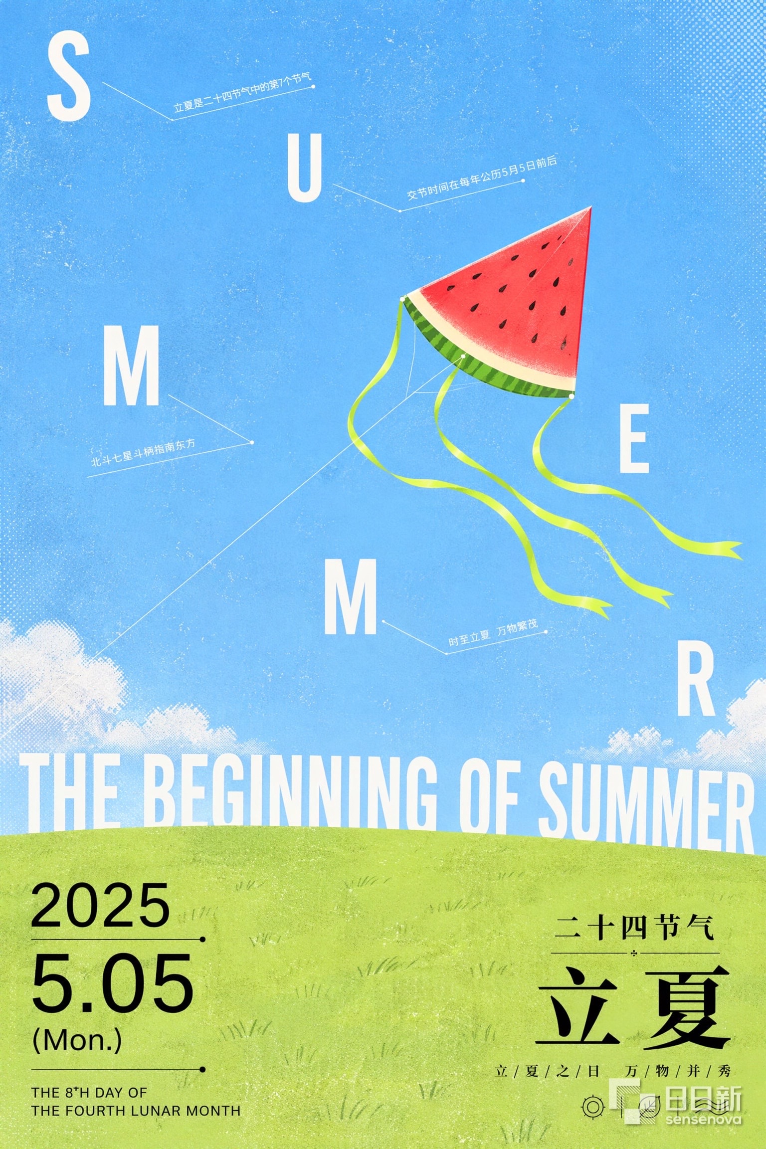
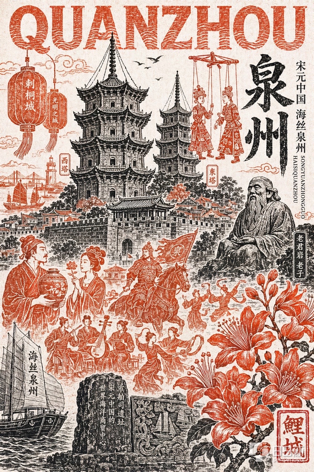

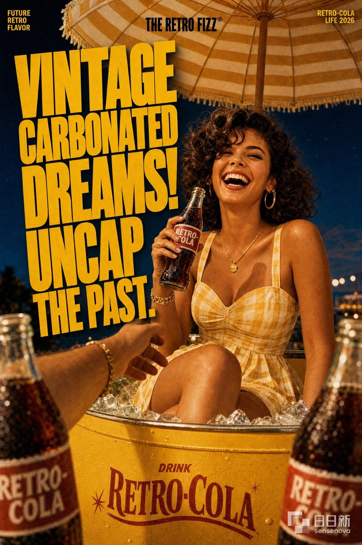
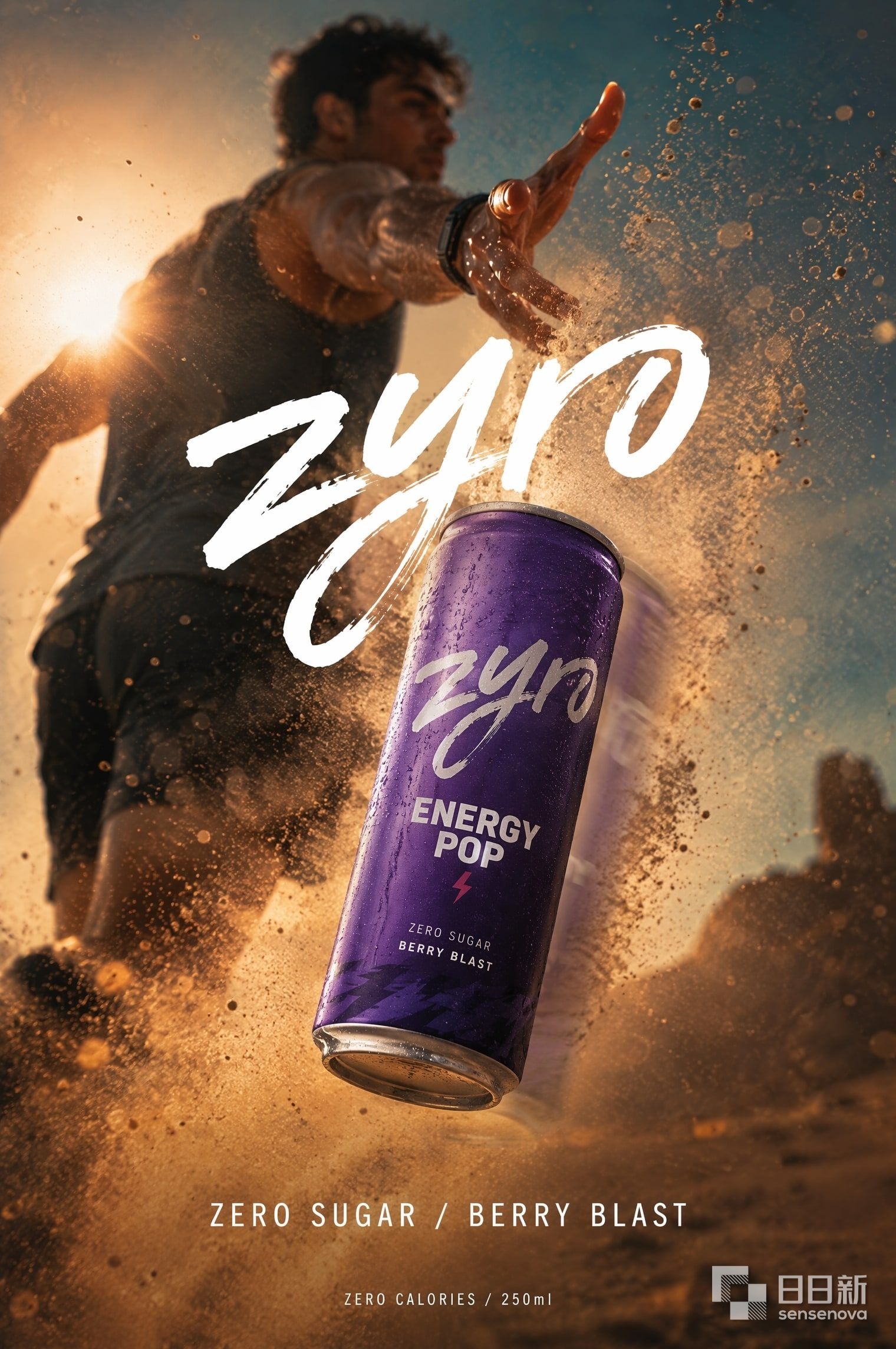


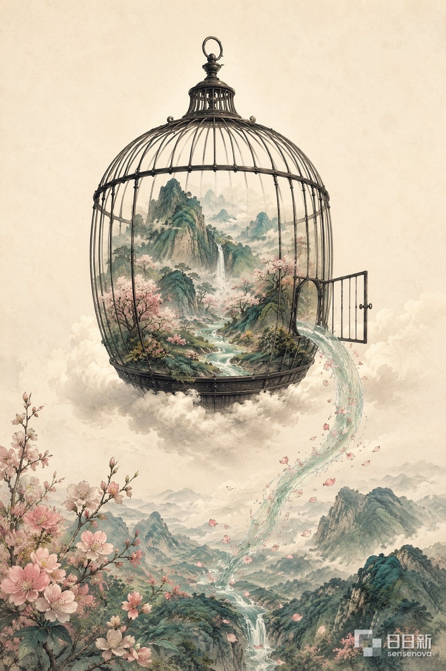
The dense text-and-image side is a completely different test: hold the layout together and keep the type correct at high density.
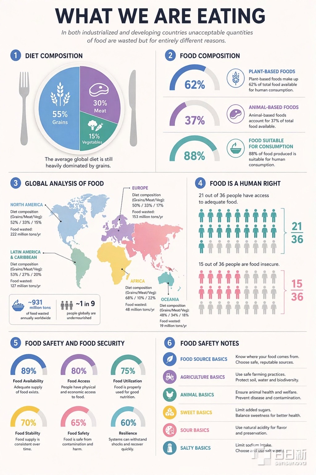
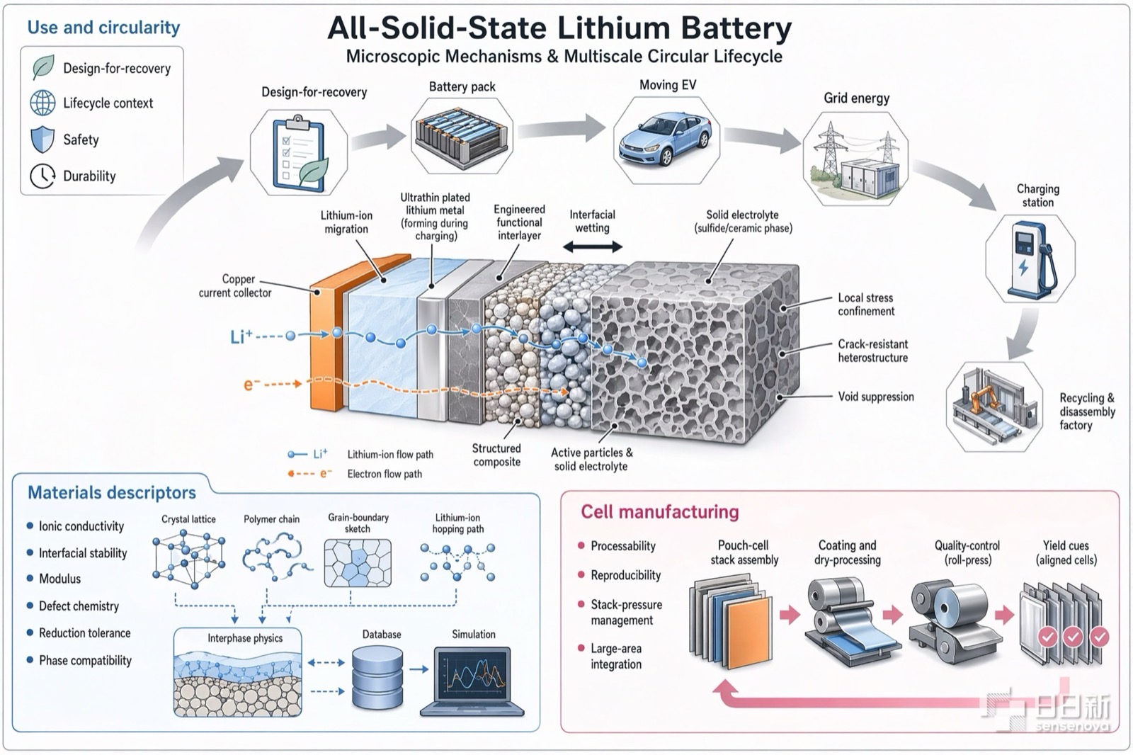
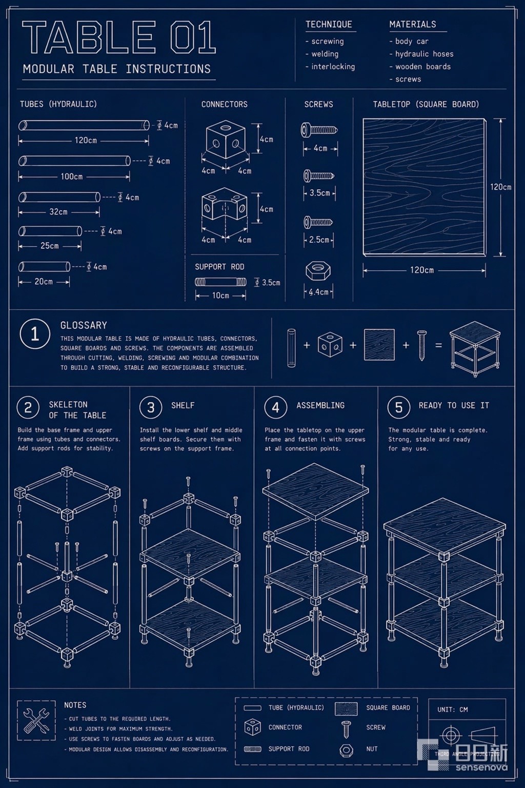
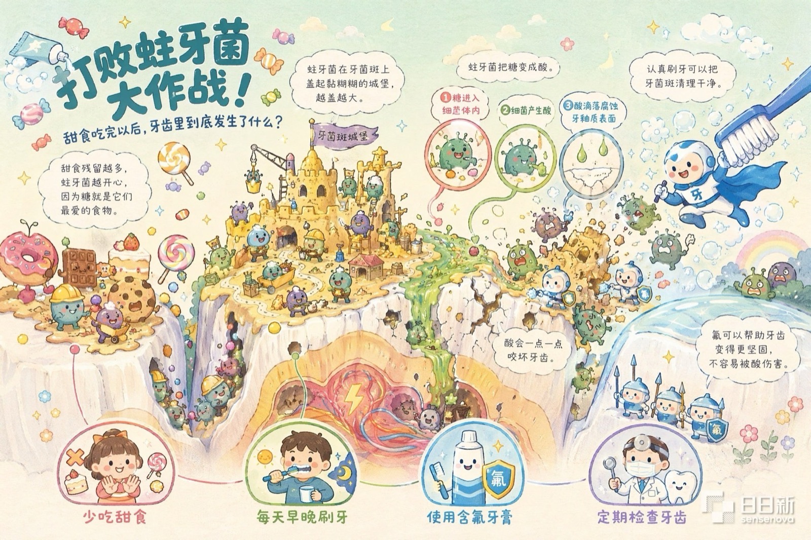
How it keeps the text from smearing
To see why SenseTime is willing to put "very low text rendering error rate" on a capability list, you first have to look at how images got built the old way.
For years, the standard multimodal architecture split the job between two components. A vision encoder did the seeing, turning images into features the model could read. A variational autoencoder did the painting, expanding a short string of numbers the model produced back into pixels. An adapter bolted the two sides together.
It's like having one person look at a painting, describe it aloud to a second person, and having that second person repaint it from the description. Big structures — mountains, rivers — survive the description intact. The few small characters in the signature do not. That's exactly the scale of detail lost when a variational autoencoder compresses and reconstructs.
There are two seams: one between understanding and the intermediate representation, another between that representation and generation. The two ends were built on different representations to begin with, so every crossing requires a translation — and the finest strokes in the image are the first thing sacrificed.
NEO-unify's choice was to delete both components. No vision encoder, no variational autoencoder — pixels and text go into the model directly as native input.
The backbone is MoT (Mixture-of-Transformer): one network holding two sets of parameters, one for understanding and one for generation, with each task routed to the set it needs. Because both sets are trained jointly inside the same backbone, there's no longer a boundary between understanding and generation that requires translation.
The architecture is a joint effort between SenseTime and Nanyang Technological University. A preview went public as a blog post back in March, but the model weights weren't actually open-sourced until April 27.
If you delete the component that paints pixels, who paints?
This is the obvious question, and the answer is a training approach called flow matching, applied directly at the pixel level.
The model learns to "flow" a field of random noise, step by step, into a finished image. Its hands are on the pixels the entire time — like pushing a pile of loose sand gradually into a sculpture. The old approach photographed the sculpture first and rebuilt it from the photo; that photograph is the variational autoencoder, and it's where the detail goes missing.
So the training objective splits into two parallel tracks: autoregressive cross-entropy for the text side, pixel-level flow matching for the visual side. That's what's actually happening inside the "generation" box on the right of the architecture diagram.
Does image quality suffer for it?
SenseTime's answer is a set of image reconstruction scores — feed in an original image, reconstruct it, and measure how close the result is.
Efficiency is the other half of the case: at equal training data volume, NEO-unify reached higher performance than the Bagel baseline using fewer training tokens. That's the other reason SenseTime is willing to bet on this route.
The weaknesses the open-source release admits to
The open-source repo includes a "work in progress" section listing four known limitations. One of them lands squarely on the same battlefield as that "very low error rate" claim.
- Text generation: rendering sometimes produces misspellings, deformed characters, or inconsistent formatting, and it's fairly sensitive to prompt wording — especially in text-dense scenes.
- Human figures: fine-grained anatomical detail remains hard, particularly when a person occupies a small portion of the frame or interacts intricately with surrounding objects.
- Visual understanding: the context length tops out at 32K, which can be limiting for longer or more complex visual contexts.
- Interleaved text-image generation: still experimental, and may not match a dedicated text-to-image pipeline. Reinforcement learning hasn't been specifically tuned for editing, reasoning, or interleaved output, so current results are comparable to the supervised fine-tuned version.
What's open-sourced is the Lite line; U1 Pro is the flagship, at a different scale, so the conclusions may differ. But U1 Pro has published no benchmark scores at all, and the closest available results are the open-source version's numbers on infographic benchmarks like BizGenEval and IGenBench.
It can change one thing without redrawing everything
The architecture solves whether text and image can align. The other half of the problem: what happens when the first image isn't right.
The answer lies in what the model writes down before it starts drawing. The open-source inference examples show the full process. Give it a photo of tea steeping in a glass and ask it to draw what this looks like an hour later, and it outputs six reasoning steps before it touches a pixel.
Read the sourceFreshly brewed hot tea, leaves still unfurling, liquid still fairly light.
Parse the instructionWhat's wanted is the scene an hour later.
ReasonOver time, tannins and pigments leach out, so the liquid darkens noticeably and evens out in tone; leaves steeped that long also swell and darken.
Expected changeThe tea shifts from amber toward a deeper brown, with higher saturation.
What must not changeThe glass, the loose leaves scattered around it, the background, and the camera angle all stay as they are.
Write the edit instructionShift the tea to a fully steeped deep amber-brown and make the leaves slightly darker and more swollen, while keeping the glass, surrounding leaves, background, and framing unchanged.
Step five is the mechanism behind changing one thing: before it acts, the model writes itself a do-not-touch list. With that list in hand, editing shifts from rerolling the whole image to a constrained local modification. The open-source repo has three more examples with the same structure — a beanbag chair after long use, an egg moved from fresh water to heavy brine, a green banana after ripening.
Close those six steps into a cycle and you have what SenseTime calls the long-horizon generation loop. Around one complex goal, it can run dozens of rounds this way.
The third version of the open-source infographic model, released July 16, targets editing specifically: local text, local content, global style, and global layout, with an explicit claim of precise text repair inside dense blocks of copy. That's exactly the "the date line smeared, fix only that line" capability.
How far the loop stretches
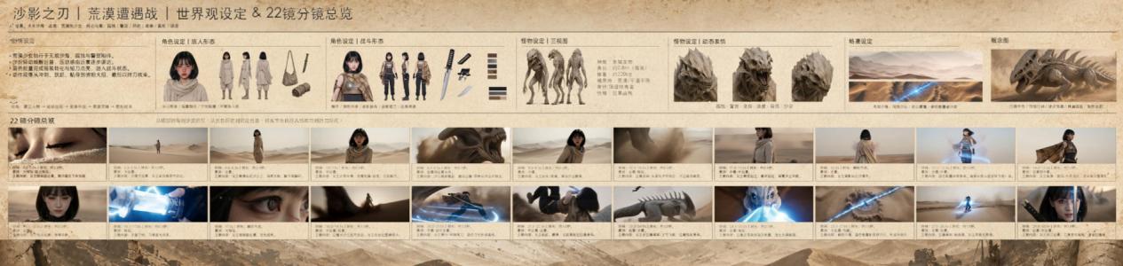
Blade of the Sand Shadow, shown at the launch, is the answer. It's a demo project covering an entire film pre-production package.
The model first produced the full visual bible on its own: world-building, hero and antagonist character designs, three-view turnarounds and expression sheets for the monster, environment designs, and concept art. On top of that foundation it then output 22 consecutive storyboard frames in one pass, each annotated with camera direction. Faces, costumes, and lighting have to stay consistent across all 22 frames — something random assembly cannot do. It requires a locked set of designs that every subsequent frame is bound to. Paired with SenseTime's video tools, the result is controllable delivery of character, plot, and visual language.
Two more pieces from the WAIC stage
1. A 4:1 ink-wash scroll
A World Convened in Intelligence, made for WAIC's ninth anniversary, is rice-paper ink-wash style at an ultra-wide 4:1 ratio. From a distance it reads as one continuous piece of Eastern landscape narrative, rivers and mountains flowing into each other. Zoom in and every conference from 2018 through 2026 has its own landmarks, events, and fine-print annotations holding the picture up. You can pick out the lighthouse and AI PARK from "2018, the first WAIC launches in Shanghai," plus "2025: One World, One Shared Future," "2026: Intelligent Partners, Creating the Future Together," and a run of names including the Global AI Governance Action Plan, "100,000 m² of exhibition space," "1,100+ companies," and the SAIL, Yunfan, and Youth Paper awards.
2. A pre-match prediction report for the World Cup final
Published July 18, before the 2026 World Cup final had kicked off. The image is a pre-match analysis and score prediction: Spain versus Argentina, with a predicted scoreline of 1–2. Each side's route to the final, key player matchups, tactical formations, passing networks, and touch heat maps are all compressed into a single image — the full run from information gathering through analysis and reasoning to complex visual delivery.
There's a related track record here, though it belongs to a different product: SenseTime's office assistant Raccoon predicted a month before kickoff that Cape Verde would be the tournament's biggest dark horse and advance from the group, which SenseTime says placed it second among 12 models making predictions. Raccoon made the prediction; U1 Pro turned the result into the image.
The open version is downloadable now; the full release comes in August
You can't get U1 Pro yet, but the open-source SenseNova U1 Lite line, built on the same architecture, has been out since April under Apache 2.0 — commercial use allowed.
| Item | Details |
|---|---|
| Open models | SenseNova-U1-8B-MoT and SenseNova-U1-A3B-MoT, two sizes. The "Lite" in the name signals these are the compact versions, with larger ones still to come |
| Parameter count | 8B-MoT means roughly 8 billion understanding parameters plus roughly 8 billion generation parameters — not 8 billion total |
| License | Apache 2.0, free for commercial use |
| No install | There's a free hosted playground at unify.light-ai.top — no setup, no GPU, runs in the browser |
| Running locally | On a consumer GPU with around 16GB, SenseTime recommends Q4 quantization with layered loading. The quantized weights were contributed by the community; SenseTime supplies the loading support |
| For speed | There's also an 8-step distilled LoRA, trading some quality for throughput |
| Production | The accompanying inference stack does a 2048×2048 image in about 9 seconds on a single H100 or H200 node |
| Training | The supervised fine-tuned version runs four stages — understanding warm-up, generation pretraining, unified mid-training, unified supervised fine-tuning — with the final version adding a round of text-to-image reinforcement learning |
| Where to start | github.com/OpenSenseNova/SenseNova-U1, paper arXiv:2605.12500 |
Two-plus months of open-source iteration have concentrated on infographics and editing.
Initial release of inference code and 8B-MoT weights
Preview of 8-step fast inference
Quantized weight support and a layered-loading memory mode, so single low-VRAM cards can run it
Technical report published, alongside the open-sourced A3B-MoT mixture-of-experts version
The Infographic model, purpose-built for information graphics
Interleaved text-image version, improving narrative continuity and character consistency for picture books, storybooks, and multi-page decks
An 8-step acceleration LoRA specific to infographics
Infographic V2 — sharper rendering of dense small type, fixes a black-background bug
Infographic V3 adds editing: local text, local content, global style, global layout
On usage, SenseTime's figures: in June, open-source users generated nearly 3× as many images per person per day as in May, and as of mid-July, the model plus SenseNova-Skills — a repo packaging it into ready-to-use skills — had passed 8,000 total GitHub stars.
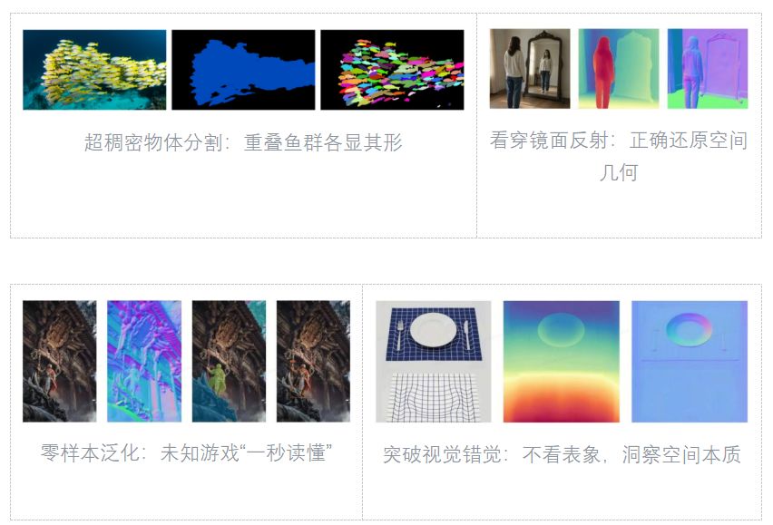
An image-understanding model shipped too
SenseTime also announced SenseNova-Vision at WAIC, built on the same native unified architecture. It turns classic vision tasks like instance segmentation and object detection into native capabilities of a general-purpose large model, rather than something stitched together from multiple specialist models.
When you can actually use it
The U1 Pro preview is now in invite-only testing, and the invite pool will widen as inference capacity grows. The public release is planned for August, with pricing and API service launching alongside it. In the meantime, the same capabilities are already running inside SenseTime's office assistant Raccoon and its video creation tool Seko.
AI image generation moves from rerolling the dice to changing one thing
SenseTime launched SenseNova U1 Pro at WAIC on July 18. One page, with diagrams, on what changed and why the text stopped smearing.
↓ One page · one animated diagram
Ask AI for a poster and the composition and colors come out right — until you zoom in and the date line has smeared into two blots of ink. You rewrite the prompt and run it again; the text is crisp now, but the QR code has jumped to the top left. The nickname for this cycle: pulling the slot machine lever.
✘ What it can'tChange one thing and leave the rest alone
Why: every prompt revision makes the model repaint an entirely new image. Every run is another pull of the lever. Small type and exact positions come down to luck.
At the World Artificial Intelligence Conference on July 18, SenseTime launched SenseNova U1 Pro. It puts seeing, generating, and editing inside one model, looping dozens of rounds around a single goal until it produces something usable as-is. Output runs up to 8K, so small type still holds at print size.
→ whole image repainted
font size right
composition changed
QR code moved
→ write the do-not-touch list
glass · background · angle · QR
then edit only that line
rest untouched
Getting there took a new architecture underneath. To see what changed, you first need to know how images used to get built.
XiaoHu wants a marathon poster: headline, the date "October 26," meeting point, QR code bottom right — all four locked. The diagram below runs that same request through two different architectures.
Put "change one thing" into concrete terms: one poster, three rounds of client notes.
All of the above are SenseTime's own figures. U1 Pro has published no benchmark scores and no third party has tested it. The closest available results come from the open-source version on the same architecture: image reconstruction scores of 31.56 / 0.85, slightly below the Flux VAE baseline (32.65 / 0.91) — dropping that compression component does cost reconstruction fidelity. The open-source release also states plainly that rendering still breaks in text-dense scenes.
ship this one.
The date is
two ink blots.
a stroke
Run it again!
That's another pull.
a new model on stage.
Blown up to print size, small type still holds
pass, faces
and lighting
consistent
format, twice
as wide as
16:9
one goal, until
it's shippable
(SenseTime)
does type break?
Each one drops strokes.
drawing share
one represen-
tation. No seam
in between,
so nothing
drops out
write what stays.
- × Background and palette
- × Camera angle and composition
- × QR code, bottom right
Open source is what's live.